Identity and brand development is in my eyes the nucleus of commercial design. The logotype is the single most important graphic any business will own, and no single piece of design will mean more to an organisations profile or public image. As a visual communicator the work can be wide and varied, one day being asked to sum up a artists personality, another day to create a new identity for a international drug firm. The challenge lies in hitting the brief. The rush comes from nailing the idea.
This article is for those new to logo design and wanting to gain an understanding of what it's all about. It's worth mentioning that there's no right and wrong way of developing logos and brands. Design and idea generation is an organic process, and all of us have our own ways of getting to the finish line. This guide outlines my process and experiences designing logos.
A Clever Logo
After studying Graphic Design and Art for three years, I left College with all my qualifications and achievements thinking that I had a good understanding of all aspects of practice design. I went on to further study for a design degree at university. Now at university I got a job as a junior designer in London to pay my ways. One of my very first projects was to design a logo for a new music label.
After some initial fumbles in Illustrator, my Creative Director pulled me aside and asked me to take a long look at the FedEx logo, and asked what the hidden trick was within its solid typeface. Bemused I said I could not see it and thought the design was a bit dull, it was only after the hidden forward-pointing arrow between the E and the X was pointed out to me that the penny dropped, and the whole world of logo design opened itself up to me. Once I'd had this FedEx revelation I soon started to see clever graphical tricks and ideas in many other logos, a notable example being the Amazon logo. No longer selling just books, they wanted a new logo that would represent them selling almost everything. The elegant answer being a joining line that not only looks like a smile, but connects the A and the Z, as in "Sell everything from A to Z". A beautiful touch that completes an iconic mark.
 Clever graphical tricks are only one aspect of logo and brand creation. The Sony logo contains no visual reference to electronic products, just as the Calvin Klein logo gives no hint as to the corporation's design ethos. Instead, both logos serve to position the brands within a certain market using type alone, which can be tricky but not impossible. For now, however, I'll concentrate on how to go about creating a "clever" logo, and why they are so effective.
Uniqueness
Logos which incorporate a graphical link relating to the business or business ethos take on a life of their own, transcending the chosen typeface and avoiding graphical clichés. The logo for the dentist Robin Rutherford (featured below) is a beautiful example of the business and the ethos coming together in a unique and engaging way. Through a clever combination of a tooth and a heart, the end result is greater than the sum of its parts, creating a unique and memorable identity. Contrast this with the number of companies whose identities use tried and tested graphical tricks, and this need for individuality becomes all the more apparent.

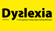
As well as being unique, idea-led identities also have the luxury of being able to ride the waves of cultural change, adjusting to ever shifting trends in graphic design without diminishing in power. A great example being when Apple effortlessly revamped their logo with the launch of the iMac, dropping the iconic stripes without losing any of the brand strength. Logos designed using nothing but these effects to differentiate themselves will fade and fall from favour as time moves on, whereas logos with a strong visual idea can adopt and drop these trends as and when they come round.
Type
The previously featured Robin Rutherford logo blended both customer care (heart) and the dental service offered (tooth) smoothly and effectively. However, often a logo that features the service or product offered simply isn't necessary.
For example, visually showing the act of consultancy or recruitment via a graphic symbol could prove tricky indeed. In these cases the designer has the option of concentrating on creating a mark that uses the text and typeface alone to place the business within the market. A clever combination of characters can be as powerful as an icon-based logo. Indeed, often character combinations can, and often do become an icon. Below are two good examples of combined character elements.
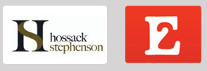
Logos of this nature are immediately memorable and have an inherent cleverness that is similar to the logos I mentioned earlier. As well as providing the business with a logo that can be applied to different areas of a brand (without being pinned down to one facet of the organisation), they are also unique to the business's name. The E2 logo featured above could only realistically be used by an organisation called E2. Compare that with a corporate "swoosh" which can be attached to any business under the sun and the advantage becomes clear. Of course, sometimes graphical trickery isn't necessary, and the client may feel that a unique or special typeface is all that's required to serve as an identity. There are no hard and fast rules when choosing typefaces for this purpose.
Colours
Selecting suitable colours for a logo is normally the last thing I do, because although important, a well designed logo should maintain its strength and integrity in black and white. This is something I feel many new designers forget in their rush to produce something pretty. Even if the logo is only intended for use online, it's a fair bet that at some point it'll be printed out on a black and white printer, photocopied, or even screened in a logo lockup on the foot of someone else's website. All of a sudden pretty gradients and stacked-up objects won't look so great. Think versatility and remember: a colour alone cannot shoulder the burden of representing a business.
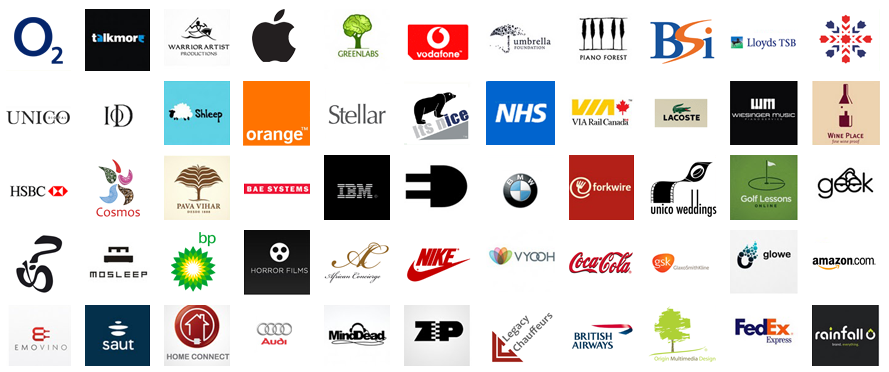
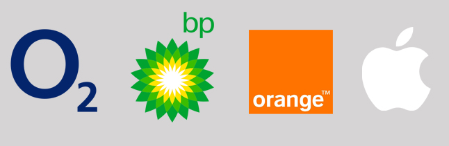
What colour can do, however, is inspire an emotional response through connotation and aid the viewer in placing the brand within known areas of a market. For example, many brand leaders use primary colours to mark their dominance of a market sector. Notably Coca-Cola, McDonalds, Intel, Vodafone, 02, Apple, BP, Nokia, to just name a few. In contrast, brand competitors or niche market business's often use secondary colours to position themselves within a sector. Examples include EasyJet, Orange, and Acer.
Colour can be used on a basic level through immediate viewer connotation. With support of the 'green agenda' as the world wakes up to global warming, the Conservative Party were quick to rebrand, introducing a green tree in their logo, in a clear effort to reflect the new environmentally conscious side of the Party. At a more advanced level, logo colour can be an indication of brand value; a recent trend in Britain has been budget brands switching to yellow and black: Comet, Morrisons and Halfords to name a few. With big brands aligning their identity with more budget outfits through colour, the idea of cheaper goods can be accentuated.
When selecting colour for a logo, research both competitors and pioneers in the same marketplace before making a decision, and make sure you have a solid justification for the colour(s) chosen. And if rebranding an existing mark, where the unmoveable client is hanging onto what you believe is the wrong colour, put together a case and turn them round. You'd be surprised how open clients become to new ideas once you show them where their brand currently is and where you wish to take it.
The Brand
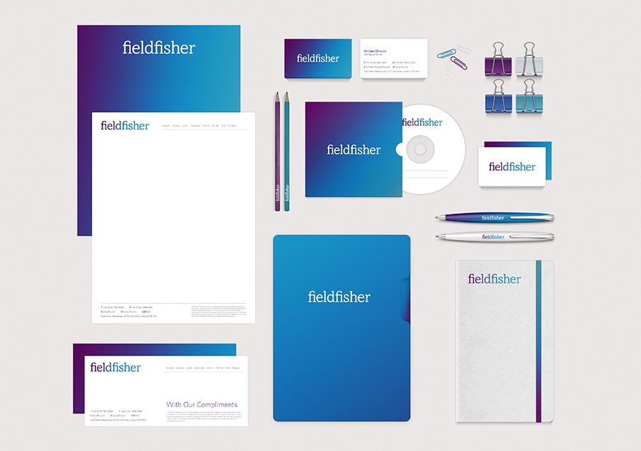 A strong idea and justification behind a logo can often be carried forward across different media, extending the logo and reinforcing the brand. Business stationery is often the first destination for an extending brand, potentially followed by brochures and flyers, CDs and DVDs, websites and even TV.
Now that you have read what I have said about logos and branding, you hopefully should be in a much better place to start thinking about what you want for your own company branding and logo. But if you are still unsure and need a helping hand throughout the development and creation of a logo, contact me.
I hope this article has given you a better understanding of the processes involved in Brand Identity. And the amount of hard work that goes into making something so simple and easy to look at, become the face of a company.